A/B testing is a simple UX research methodology for understanding user engagement and satisfaction of a new feature or product. At Booking.com we use this constantly to validate changes we make to our website. The way it works is: half of our traffic sees the current version of the website ( A ) and half see the new feature (B). We observe how each side performs and decide if the new feature is better for our customers. This is the story of my first A/B test or experiment ( as we call them internally ).
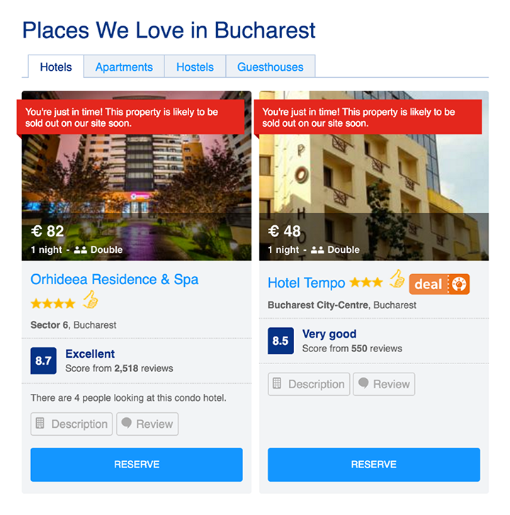
On our city landing pages, we have a block with recommended properties. You click on one of them and you go to the property page. Simple.

The product owner in my team asked me to help set up an A/B test in this area:
I want to run an experiment and take users to search results with that hotel pinned on top, instead of taking them to the property page.
He's talking about taking users one step away from the shopping cart, to the list of all hotels in that city. Are you kidding me?! Somewhat begrudgingly I accepted. This was only my second day, so I thought this is part of onboarding, using an absurd idea just to see how setting up an experiment works. I set it up, ran the experiment, and… it’s a success. 🤯
You see my PO spent the last couple of evenings watching tens of videos of users interacting with our website and noticed a pattern. Users click on the hotel, go to the property page but then they go to Search Results and compare that hotel with others. Que internal monologue:
Who’s going to land on a city page and book the first hotel the see? You’re going on vacation and you want to make sure you get a great deal for your hotel so that you have more money to spend on activities when you arrive there. This is not impulse shopping where you buy bubble gum on your way to the counter. We’re not H&M where you buy a wedding dress just because it was on sale at 4.99.

This taught me that my education, the fact that my website went viral, and got me a job at Booking.com — the Mecca of design with data — all of this doesn’t mean anything if I’ll be arrogant and think I know best.
The most valuable thing that I learned at Booking.com and the one I would like to give you as advice today is:
Stay humble
Keep in mind that you are here to serve your users. They have all the answers and the only way to find them is by talking to them. It can be through user testing or analytic tools. At times it can become frustrating, especially when you worked your ass off for a design and they don’t like it. But don’t lose hope. Get back up, dust yourself, and learn from it. And always. ALWAYS. Make sure you have some way to validate your design.
....
This is an excerpt of my talk: Divergent by Design
Posted in AB Testing Conversion Optimization